Passion Atomic Design System
This design system includes all of the elements that we need to build pages in Webflow. You are able to copy and paste elements into other pages. DO NOT change any of the styling of the elements. We follow an atomic design structure.
What is atomic design? Atomic Design is a methodology inspired by chemistry. Just as all matter is made out of atoms that combine to form molecules, which in turn make up more complex organisms, Atomic Design involves breaking a website down into its basic components and then working up from there to create a site.
Watch this if you have an hour to kill: https://www.youtube.com/watch?v=84LZyZsTiaA
Our pages are built in this order: Structure, atoms, molecules, organisms, templates, and pages.
Structure
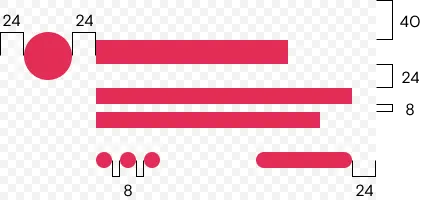
8-Point Grid
All of our layouts are based off an 8 point grid, shown below:
Responsive Flexbox Grid
Columns need to be nested within a "-grid-row" and a direct child of a "-container". All columns start off at equal-widths by defining the class of "-col" and auto-collapse at the mobile portrait breakpoint if no responsive classes are defined.
Responsive Grid
To define our 12 column grid, all classes must precede with the initial class of "-col". Examples of how to use this below:
col-1
col-11
col-6
col-6
col-4
col-8
col-9
col-3
Text Align
is--align-left
is--align-center
is--align-right
Float
is--float-left
is--float-right
Vertical Align
is--align-top
is--align-middle
is--align-bottom
Margins
All margins follow an 8px grid (8/16/24/32....). mt = top margin, mb = bottom margin, mr = right margin, ml = left margin, mx = horizontal margin and my = vertical margin.
is--m(side)--(px value). For example: is--mt-40 or is--mx-auto
Atoms
Colors
Brand colors
primary
secondary
cta
Additional
additional1
additional2
additional3
additional4
Black / Gray scale
secondary
secondary_900
secondary_800
secondary_700
secondary_600
secondary_500
secondary_400
secondary_300
System
error
success
link
Typography
t1
Heading hero
h1
Heading H1
h2
Heading H2
h3
Heading H3
h4
Heading H4
h5
Heading H5
h6
Heading H6
body--text-l
Body Text L
body--text-m
Body Text M
body--text-s
Body Text S
body--text-xs
Body Text XS
body--heading-xl
Body heading XL
body--heading-l
Body heading L
body--heading-m
Body heading M
body--heading-s
Body heading S
subtitle-text-l
Subtitle L
subtitle-text-m
Subtitle M
subtitle-text-s
Subtitle S
Colour Typography
To color text add the name of the colour after: is--text-(colourname) - Example below...
is--text-white
is--text-primary
is--text-gradient
